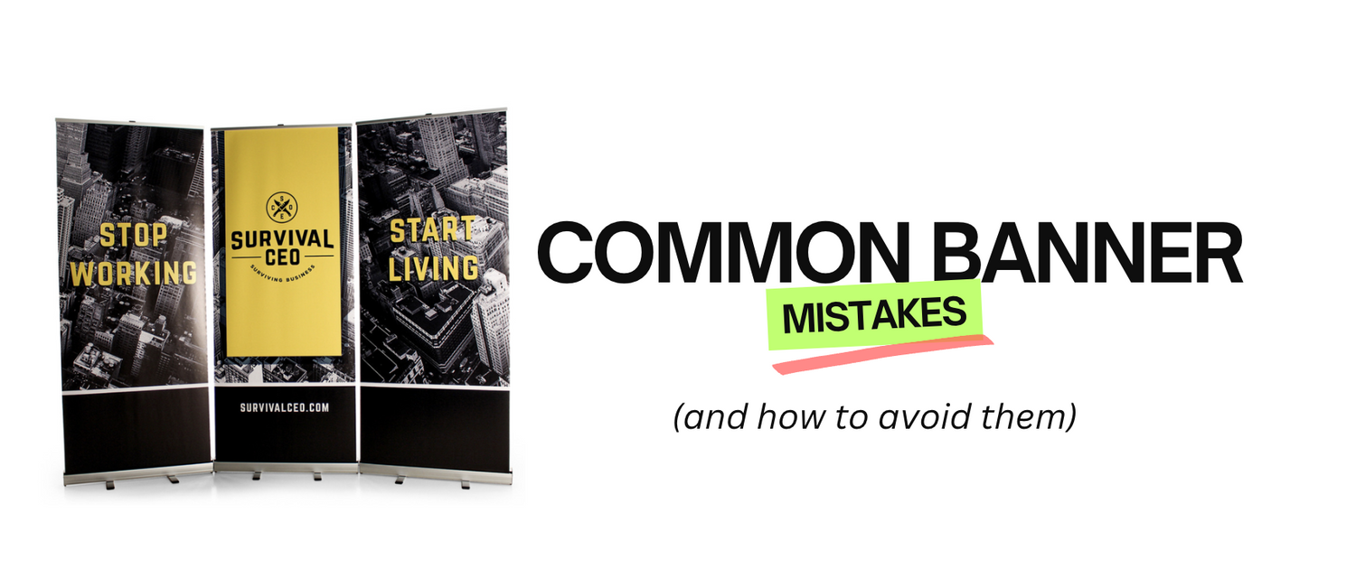
Custom banners are both visual and informational tools that can help communicate your brand’s message quickly and effectively. Businesses with eye-catching and well-placed banners are said to experience more engagement from event attendees. But while banners can be incredibly effective, they can also fall flat if not designed and placed correctly.
In this blog post, our goal is to help you avoid the common mistakes we see people make when designing custom banners by providing insights into design and placement mistakes, ensuring your banners stand out and achieve their intended impact.
5 Common Mistakes When Designing Custom Banners and How to Avoid Them
1. Ignoring brand consistency
One of the most significant errors is neglecting brand consistency. Your banner should be a reflection of your brand’s identity, but often, businesses use different logos, colors, and fonts that don’t align with their established branding. Consistency reinforces your brand’s image and makes your booth instantly recognizable. Use high-quality images of your logo and maintain a uniform color scheme to keep everything cohesive.
2. Overloading with information
We understand that it’s tempting to include as much information as possible when designing your custom banner. But cramming too much text or too many images in one plane can overwhelm and confuse your audience. Focus on putting a clear and concise message. Your banner should highlight key information such as your company name. Use bullet points or short phrases rather than long paragraphs.
3. Poor quality image
Low-resolution images or blurry graphics can make your banner look unprofessional and deter potential customers. Use high-quality resolution images that are appropriate for large-format printing. Ensure that all graphics are sharp and clear, even when scaled up. At CustomBannerLab, our advanced printing technology guarantees vivid colors and crisp graphics to help make your banner stand out.
4. Neglecting readability
Fonts that are too small or styles that are too hard to read can make your message difficult to understand, especially from a distance. Choose fonts that are easy to read from afar. Make sure the text size is large enough to be read from a reasonable distance, and use high-contrast colors to enhance readability.
5. Not considering placement and visibility
A banner that is placed in an awkward position or hidden behind other displays won’t be effective, regardless of how well it’s designed. To avoid this error, strategically plan where your banner will be displayed to maximize visibility. Ensure it’s placed where it will be easily seen by attendees, and consider the flow of foot traffic around your booth.
Common Design Mistakes
Cluttered Design
A cluttered banner can overwhelm viewers and obscure your message. To avoid this, aim for a clean and straightforward design. Use ample white space to ensure your key message stands out and is easily readable. Focus on a central message or theme to maintain clarity.
Poor Color Choices
Colors play a crucial role in visibility and brand recognition. Poor color choices can make text hard to read or blend in with the background. Opt for high-contrast colors that ensure readability from a distance and align with your brand’s color scheme. Avoid using too many colors that can distract from the main message.
Unreadable Text
If your text is too small or uses a difficult-to-read font, your message may be lost on your audience. Ensure your text is large enough to be readable from a distance and choose a font that is clear and simple. Stick to one or two fonts to keep the design cohesive.
Low-Quality Images
Low-resolution or pixelated images can make your banner appear unprofessional. Always use high-quality images that are sharp and clear. If you’re including graphics or photographs, ensure they are of sufficient resolution to avoid any distortion.
Lack of Call to Action (CTA)
A banner without a clear CTA misses an opportunity to engage your audience. Include a compelling CTA that directs viewers to take the next step, whether it’s visiting your booth, scanning a QR code, or contacting your team. Make sure your CTA is prominent and easy to follow.
→ For more tips on designing an effective banner, check out our blog post 5 Custom Banner Ideas and Tips to Ensure Success at Your Trade Show Event
Common Placement Mistakes
Ignoring Visibility
Placing a banner in a location where it’s not easily visible can render it ineffective. Choose a spot that maximizes visibility and ensures that your banner is seen by the largest number of attendees.
Inconsistent Placement
Inconsistent placement can confuse attendees and diminish the impact of your banner. Ensure that your banners are strategically placed to guide visitors to your booth and reinforce your message consistently throughout the event.
Blocking Key Areas
Avoid placing banners in a way that blocks pathways or other important signage. Your banners should enhance the event space, not obstruct it. Make sure they are positioned to complement the flow of foot traffic and other event elements.
Neglecting Height and Size
Placing banners too high or too low can affect their visibility. Consider the height of the placement relative to the average eye level of attendees. Additionally, ensure the size of the banner is appropriate for the space and audience.
Not Considering Lighting
Poor lighting can affect the visibility of your banner, making it difficult to read or see. If possible, place your banner in a well-lit area or use additional lighting to highlight it, especially if the event space has dim lighting.
→ If you want to learn more about custom banner placement, here’s a dedicated blog for this topic: Best Places to Put My Sign at A Trade Show
Avoiding these common banner mistakes can make a significant difference in the effectiveness of your trade show presence. By maintaining brand consistency, simplifying your message, using high-quality images, ensuring readability, and strategically placing your banner, you’ll create a compelling visual that draws in your audience and makes a memorable impression.
At CustomBannerLab, we’re here to help you every step of the way. From high-resolution, custom-designed banners to expert advice on placement and design, we’re committed to ensuring your trade show display is nothing short of spectacular. Let’s work together to make your next event a success!
Related Posts:


